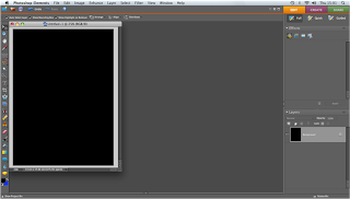
Firstly we started off with a blank canvas and filled it in with the colour black.
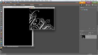
We then found an elegant pattern that we wanted to use within our Advert.
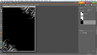
Once we had applied the pattern to our Advert we duplicated the layer so that we could apply the same pattern to the opposite side of the canvas.
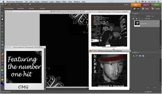
We then found the images we wanted to use within our Advert which included the front and back cover of our digipak.
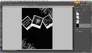
We then resized the images and applied them to our canvas.
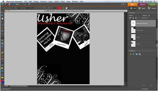
We then used the text tool to add the title of the artist and the title of the album.
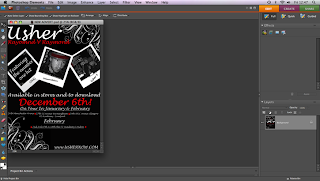
Lastly we added the rest of the text, again using the text tool. We included the date the album is going to be released, tour dates and Ushers website.
No comments:
Post a Comment