Tuesday, 22 March 2011
Marking Criteria
Framing a shot, including and excluding elements as appropriate: Framing a shot is all about capturing the correct footage you need inside the lens, and excluding all the aspects that you don't need. Background factors which can spoil footage is the inclusion of dead space in the background or the lighting rig. We tried our hardest to make the center of the shot the main focus, however some shots vary which is all deliberate.
Using a variety of shot distances as appropriate: Using the same shot distance throughout the whole video would make the video seem tedious and boring for the viewer to watch. With a little bit of creativity, Kristie and I used a variety of shots to draw the audience closer and to capture the main focus points, for example a part of the video includes an extreme close-up of the males feet as he dances, and if we used a long shot to capture that dancing, we wouldn't be emphasizing his talent as much.
Shooting material appropriate to the task set: Upon scheduling and planning our time for the music video, Kristie and I performed background research in which we looked into genre conventions from other music videos of the same type, such as Jason Derulo and Ne-yo, as well as audience research into what fans of this genre expected from the music videos.
Selecting mise-en-scene including colour, figure, lighting, objects and setting: Looking at other artists such as Usher, Ne-yo and Chris Brown, we realized that a lot of these artists wear casual/formal attire consisting of blazers and trilbies. The digipak and advert was promoted in black and white, in order to give a feel of nostalgia, however the females lips are spilled with red, showing lust and love, hence showing that we thought about this factor. The females lips are also spilled red in the actual video at certain points. The setting of part of the video was in a nightclub called The Showroom which is situated in Hartlepool. We chose to film in a nightclub because of the popular culture that Usher falls into in the current day, and his music would be played in a club. The exposure of the female also gives the feeling of a "night out" as she is dressed to impress the male. The other film location, which was the studio, was used to capture intimate shots, as well as take advantage of the lighting rig provided, as well as the green screen behind and highly technological camera software.
Editing so that meaning is apparent to the viewer: After careful consideration before filming, Kristie and I also decided not to include any sort of narrative in our music video but base it completely on performance from the dancers. Our editing is purely down to the change in beats and in the change of music as the song progresses, therefore our editing had to be precise to make sure that the music wasn't out of sync with our own video footage.
Using varied shot transitions, captions and other effects selectively and appropriately: Not all of our shots linked in with each other, due to filming and other disturbances, therefore in order for it to flow correctly in certain places, we inputted certain transitions such as fades, dissolves and blends accordingly. We selected the location of these transitions so that they made an impact, instead of making the video just look like it was badly organized.
Using sound with images and editing appropriately for the task: We didn't use sound and still images combined much throughout our video, but we did use it for the completion of our animatic before we actually constructed the final video. Another instance where we used this combination was on most of the evaluation questions in which stills from other music videos, as well as our own, where included for evidence purposes, along with bits from the song and also a commentary from both Kristie and I.
Friday, 18 February 2011
Usher - OMG (Final Cut)
Our three final products link together through style and colour. Within the final cut version of our music video we adjusted some of the black and white parts to give a hint of red when the female was performing, this made the colour of her lips and nails stand out. We thought this looked extremely effective, therefore we chose the colour scheme for our advert and digipak to be black, white and red so that our three final products would compliment each other. We also took some screen grabs from our video and inserted them onto our digipak to make a direct link to one and other.
We have received some positive feedback from our audience who also watched our rough cut and stated that we have improved and developed our work a great deal. After receiving negative criticism from our rough cut we made some vital changes such as adding more variety of shots, filming more footage, adding different locations and using plenty of effects to achieve the best outcome possible. Overall we are pleased with our final cut and have thoroughly enjoyed increasing our knowledge upon this topic and creating and successful piece of work inspired by the R&B music genre.
Merchandise
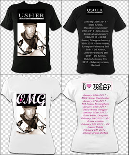
CD Cover Inspiration
9 Frame Analysis
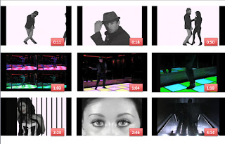
We have taken nine random screen grabs from our music video, of different shot types and locations, to explain the reasons behind each frame and why they worked effectively.
The first shot shows a long-shot of the male performer about to start his dance routine with the female performer. This is a key shot as it introduces the female into the video and lets the audience know that there are two entertainers within our music video. A simple white background is used within this shot, as it brings out the shots tonal qualities and makes the subject immediately stand out. We found that the black and white theme is becoming more and more common within real media products; therefore we added elements of black and white within our own work.
The next shot shows a meat shot of the main subject, research into similar products, shows that audiences like to see a lot of the artist within a music video. Therefore we used many meat shots of the artist looking directly at the camera in order to successfully engage the subject with the viewer. We used bright artificial lighting when filming our work to create clear, flawless footage of the performers within our video.
The third shot shows a long-shot of both performers dancing within our video. Both performers display an affectionate connection within this frame as they are dancing close to one and other and looking into each others eyes. Both performers understood that it was important to display chemistry when filming to make our video look as realistic as possible.
The next shot shows four repeated long-shots of the male performer. These shots introduce our next location to the video and create a lively atmosphere through the colours of the dance floor. Each shot appears exactly on the beat of the music, which is important to us as most real media products display this convention.
The fifth shot appears directly after the previous shot to let the audience see the colourful location on a wide screen scale. This long-shot shows the male dancer carrying out a dance routine. The upbeat street dancing complements with the colours within the shot as they both create a pleasant vibe within the video.
The next shot shows a close-up of the main subject’s feet. We decided to include this footage as we wanted to exaggerate the fact our video is performance based and show a close-up of the performer’s steps.
The seventh shot shows a medium close-up of the female performer posing. This shot shows an effect we created in Final cut, which involved a huge amount of layers. A hint of red is shown within this clip to make the shot more eye-catching and to draw the audience’s attention to the female. We used bright side lighting to enhance the female’s features and draw attention to the female’s beauty. Most real music videos include stunning females within their videos, so it was important for us to capture the female performer looking her best.
The next shot shows an extreme close-up of the female performer’s eyes. We used front artificial lighting when capturing this shot as we wanted the shot to be intense, in order for the audience to be drawn into the female’s immaculate appearance. As the meaning of our chosen track is about the artist being in love with the females physical features, we wanted to portray this within our work this by shooting close-ups of different characteristics the female possesses.
Lastly this is a long-shot of the male performer positioned in our third location. This shot is different from our other footage as it is much more dark and mysterious. The performer was located onto some lit up stairs, which created a shadow effect which is often shown in real music videos.
Evaluation Questions
The track we chose to use for our music video is ‘Oh My Gosh’ sang by the well-known R&B solo artist Usher. We decided on this track as it complements with the style of dancing the main subject is used to performing and it is within the genre we wanted use.
When creating our work we took Andrew Goodwin’s music video theory into consideration and identified the five key aspects of a music video, that we as an audience should focus on, these are thought beats, narrative and performance, the star image, relation of visuals to a song and technical aspects of a music video. We have related each of these points within our own music video.
Our media product uses several forms and conventions of real media products such as the professionally choreographed routines by the performers throughout the video. The male dancer delivers an exceptional performance and is accompanied by an attractive female who dances alongside him. The main subject invents a routine which works effectively alongside our chosen track, as he manages to dance to the rhythm of the song and captures almost every beat. This links in with Goodwin’s theory as it is important for an audience to identify the beats within the song through the music video. The dancing and lip-syncing throughout the video demonstrates a real music video, as the majority of videos present both elements, as shown in (Jason Derulo’s video- In My Head-1:07).
Goodwin believes that narrative and performance within a music video work together in order to make it easier for an audience, to watch a video repeatedly without loosing interest. Although this occurs in some music videos, our product challenges this as we have not included any narrative within our music video. Our video is performance based, which gives our main subject the opportunity to display his talent and give the audience the impression that he is not only an amazing singer, but a talented dancer and performer. This is shown in videos such as (Chris Brown-Forever-1:12) as he shows the audience he has the complete package of a true R&B star.
Another convention we noticed is that most male R&B artists include provocatively dressed women in their videos to either show-off their love interest or convey Laura Mulvey’s male gaze theory ‘The pleasure involved in looking at females bodies as (particularly, erotic) objects’ this is shown in video’s such as (Bottoms Up by Trey Songz -2:21). We have implemented this theory within our music video, as the costumes used for the female performer are exceptionally eye-catching and feminine to attract a male audience, as well as a female audience. Similar costumes are shown in videos such as (Eve- Tambourine -0:05) and (Timberland- Carry Out -1:35).
Another aspect Goodwin believes is extremely important within a music video is the star image. The main subject within our video is well groomed, as he is dressed in smart suits and hats which is shown in videos such as (Ne-Yo- Because of you -0:47). Richard Dyer also believes ‘a star is an image constructed from a range of materials’ he believes a stars image should contain a USP that fans can copy and admire. Within our video our male performer wears unique clothing such as neck scarves and trilbies, has the company of an attractive female and shows of his many talents through his dancing and lip-syncing. These are all aspects that we have put together in order for our audience to aspire to be our main subject and create a star image, which is shown in most real R&B music videos.
Our video is uses amplification, to retain a link between music and visuals, as although the performer isn’t doing exactly what the words of the song say on screen, there are still some links shown between the words of the track and what is shown within the video. We have repeatedly used the three initials of the song title ‘OMG’ on screen, to emphasize the words that are exaggerated within the song. We were inspired by similar videos such as (Ne-Yo-Closer -0:54), (Kanye West- Welcome to the good life -0:02) and (Chris Brown- I can transform ya -0:09) all of these videos show the artists writing the title of their songs to highlight a direct link between what we hear and see on screen.
Another factor that relates the visuals of our video to our song is through the beat of the music, we used two clips from our music video of our subject performing and used digital effects to flash the images one after the other, to match the beat of the music and show an increase of speed within the track. This is shown in (Ne-yo’s- Closer -1:00) video and (Kanye West- Gold digger -0:20) as both of these videos show links through the beat of the music and what we see on screen. This also links in with Goodwin’s theory as he believes music videos are related to the visuals of a song through disjuncture, amplification or illustration.
Looking at the technical aspects of our music video we understood that audiences like to see the star a lot in a music video, therefore we used meat shots, medium close-ups and long shots of our performer dancing and singing alone. We edited our video by cutting shots exactly on the beat of the music to add variation and give the video a fast pace as shown in most real music videos. We developed our editing skills by taking inspiration from real music videos and using similar effects such as the effect shown in (Akon’s- I wana love you video-0:12) we thought this looked extremely effective and interpreted it in our own way. We used a black and white effect when filming our footage as we thought it would be a good idea to balance our video taking into account that some of our footage would be extremely colorful such as (Justin Timberlake’s- Rock your body video-1:35). As well as using a black and white and a colorful location we decided to mix them both together and add hints of color to the female’s lips and nails to give a subtle but effective combination. This is also a convention used in a real media product such as (Ne-Yo’s- Go on girl video -0:09).
From start to finish our media product uses forms and conventions of real media products and shows creativity, originality and professionalism throughout. Looking into similar products has helped us understand the level of skill required and conventions needed to make a successful music video.
Sean Farnsworth
Q2. How effective is the combination of your main products and ancillary texts?
The first aspect that is very clear to point out is the similarities that the three types of media share. The same colour theme is consistent throughout in all three media pieces the red showing love and lust demonstrates that through black and white bleak times, love and lust can still be found (screengrab). Kristie and I thought carefully about our choice of colours and we both agreed that it has been produced well and represented outstandingly. The way in which the performers dressed and the presentation of them in the digipak and advert, is almost defining a brand label associated with the genre of music, which we expected to create. Kristie and I viewed similar media texts, which are relevant to the artist’s genre we had chosen, and realised that eye-catching imagery was more important than loads of words describing the genre and artist. The idea of imagery in both our ancillary texts and video are portrayed through the artist’s attire, along with the clothing that the female dancer was wearing.
The idea of New York City (screen grab) in the background is stereotypical for artists and celebrities. Another aspect of the digipak which is worth noting is the fact that there is a road sign with names of famous streets in New York City, but if you look carefully, you notice the inclusion of Ushers name on one of the arrows (screen grab) and the name of the featured album, demonstrating the success of the artist. Coinciding with his theory, we have chosen examples from Jay-Z’s video for “Empire State of Mind” (screen grab)which includes similar street signs and also is based on New York City, claiming it to be the best city in the world and a desirable place to live. The idea is that New York City is possibly the famous city in the world, and like the song “Empire State of Mind” says, if you can make it there, you can make it anywhere.
After watching the music video and looking at the digipak and poster, you will be able to notice the similarities in the colour schemes and the outstanding red in the digipak and video. The colours are also making the female both in the video and on the other ancillary texts, stand out from the male. (screen grab) Information that’s on the digipak is also present on the advert and a big point to make is the inclusion of a close up of the main artist on the front of the digipak. This is also mimicked on the advert as the advert appears again, although one page is different to advertise the tour and album widely(screen grab).
The same font style appears in both the digipak and advert, which could also be linked in with the font we see in the actually video, when the female artist spells out the letters OMG. On the digipak, it is relevant to say that Kristie inputted the spine on the digipak so that it will fold correctly without missing out key parts of the digipak.
Kristie Wilson
Q3.What have you learned from your audience feedback?
Our audience feedback has helped us develop our video significantly, from the early stages of our video when our rough cut was presented up until our final cut version. We introduced our rough cut to family and friends in order to receive constructive criticism about what improvements we could make, a number of comments were made about how the video lacked variation of shots and became uninteresting after a while.
Once we had acknowledged the negative criticism we decided to shoot additional footage in a range of locations as we were determined to produce the best possible outcome for our final cut version. When our video was complete we staged another viewing to the same audience, to see if they thought we had improved our work. Our audience were amazed at how far our video had progressed and stated that the video was enjoyable to watch and includes all of the conventions required to make a successful R&B video.
The audience also pointed out that our video had an energetic feel to it through the burst of colour within one of the locations and the upbeat street dancing, this was important to us as we wanted to create a lively atmosphere within our video.
Our college uploaded our video onto Youtube in order for people to view our work and for us to get unlimited access to our music video. So far we have had a large number of views from our rough-cut to our final cut. Comments on Youtube made about our video include ‘this s really good, well done’. We are pleased with our work and hope to receive more feedback in the future (SCREEN GRAB OF YOUTUBE).
Also the male performer within our video proudly posted the video on a social networking site named Facebook, (SCREEN GRAB OF FEEDBACK) the video was well received and gained thirteen ‘Likes’ and over twenty comments from varies people saying how good the video is.
The female performer within our video also stated that she felt comfortable within the environment she was working in and believed we had organised everything efficiently and that she enjoyed taking part in our video (CLIP OF REBECCA TALKING).
We have learned a great deal from both negative and positive feedback as we value people’s opinions and understood were improvements had to be made which pushed us to do the best we could with the equipment and resources we had.
Sean Farnsworth
Q4.How did you use media technologies in the construction and research, planning and evaluation stages?
In order to construct a video of the highest quality and relevant to the genre of Hip-hop and RnB, both Kristie and I conducted research through the means of surveys and also our own observations from looking at our related artists such as Ne-yo and Akon. To track our progress and findings, we illustrated them onto a blog site called Blogger (screen grab), which allowed others to access the information we found, and also teachers to confirm that the ideas we were attempting were actually possible. To retrieve the track, we accessed YouTube to find the original video with the best quality, and then converted it using a converting programme called ZamZar (screen grab), in which we stripped the media of the video and just had the track to play around with and use.
The ideas presented on Blogger varied from different media conventions, present in the modern day. The simplest ways of presenting the findings were the use of basic Microsoft programs such as Powerpoint and Word which allowed us to express ourselves blandly. We realised that new media conventions needed to be used in order to keep the audience entertained and also to show our vast improvement from AS to A2. Whilst our Word and Powerpoint documents could be uploaded by using an internet site called Slideshare (screen grab), which basically allows other people to view work that we have produced, but we had the option to privatize the documents, we stumbled across a great new way to express ourselves and present our work efficiently.
Prezi (screen grab) is an online service which allows the user to combine many different areas of media in order to create a singular, overpowering presentation. Media such as videos, music and images can be included to appeal to the audiences’ eyes, however little text is usually added for entertainment purposes. As far as copyright laws stretch these days, permission had to be vital in order for us to follow through with the task at hand; so another new media convention, which is very common in today’s society, is the use of social networking. We messaged Usher on his official MySpace (screen grab) page which is accessed regularly by all the artists and representatives, as well as using Facebook (screen grab) to conduct our surveys and question people on certain topics of the genre.
To construct our video and to get a general image of what the actual video would look like, Kristie and I created an animatic (screen grab) of the types of shots and how long they would last. To capture the images and upload them onto the MAC, we used the Nikon D80 and then we used the program iMovie in order to import the downloaded track and to edit the length of shot, to give us a general idea of how many shots we would be using and what type.
After completing the animatic and all other research tasks to ensure we were fully ready to record, we began plotting locations and settings times in which to meet up with the equipment and props. Whilst recording in the studio, we used the green-screen to give us a smooth, consistent background, along with the use of the Sony HDV cameras, (screen grab) which provided top quality recording and also a steady shot. The shots used were not only recorded onto the tape within the actually camera, but they were also captured on the MAC which was connected to the equipment. The MAC also provided the effective given to the final cut of the video, in which the majority of the shots are black and white, with a hint on red on her lips to show lust and for them to stand out; established using the spill (screen grab) tool on the editing software.
In order to film in different locations, we used a camera which provided the same quality of the studio cameras, but at the same time was portable and easy to set up. I received a tutorial on the basic functions of the Canon XL2 (screen grab) in order to operate it to my best ability, and as you can see in the final cut, the camera served its purpose well.
The beginning of the music video includes a brief introduction which gives the audience background information about the track, such as the name and when it was released. The inclusion of the “MTV Base” logo is used to coincide with our audience factor, as we are aware that people, who will like our music video and music, will associate themselves with the content on MTV Base (screengrab).
About half w ay through our video, we use a piece of technology which rivals what is seen in Kanye West’s video for “The Good Life” (screen grab) in which the artist writes on the screen. We used a program called Live Type (screen grab) to import and create the letters we needed to put in our video. The result of it wasn’t as good as we expected it to look however we believe the audience will be able to identify what we were trying to accomplish.
Like previously stated in the planning section, Kristie and I used the online service of Facebook to gain feedback from both the people involved in our video and also the general public on what they thought of the video (screen grab). Screenshots are given to show audience feedback and comments. The recording studio was also used again to interview the actors in our music video to evaluate the planning and effort shown by Kristie and I (screen grab). The filming was then edited by Kristie and I on the program Final Cut again, which also included aspects from Live Type to introduce the actors and ourselves. Zamzar was used again to download the videos from YouTube and to import them into the evaluation, along with using them to take screen grabs.
Friday, 21 January 2011
Development of Advert
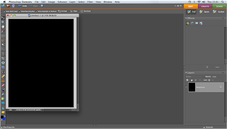
Firstly we started off with a blank canvas and filled it in with the colour black.
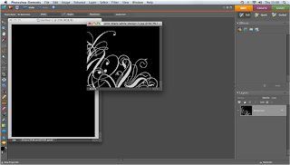
We then found an elegant pattern that we wanted to use within our Advert.
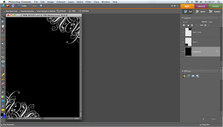
Once we had applied the pattern to our Advert we duplicated the layer so that we could apply the same pattern to the opposite side of the canvas.
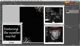
We then found the images we wanted to use within our Advert which included the front and back cover of our digipak.
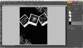
We then resized the images and applied them to our canvas.
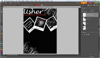
We then used the text tool to add the title of the artist and the title of the album.
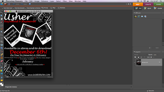
Lastly we added the rest of the text, again using the text tool. We included the date the album is going to be released, tour dates and Ushers website.
Thursday, 20 January 2011
Digipak & Magazine Brainstorm
- Artists name
- Singles title
- Bar-code
- List of actual albums songs
- Album title
- Spine of cover
- Need to find out artists tour dates for advert
- Front cover- close-up of male performers face
- Back cover- both performers
- Elegant writing
- Black, white & red colour scheme
- 3 panels
- Bold
- Use the letters OMG
Thursday, 13 January 2011
Usher - OMG (Rough Cut)
- drags on for too long
- no variety of shots, mostly long shots
- needs something more
- to improve use more locations
- good dancing,improvements are needed.
After acknowledging our feedback we understand that we need to add in our other footage in order to mix our video up and possibly film some more footage in different locations. Overall our feedback has helped us a great deal as we now know what improvements need to be made.
Usher- OMG (Animatic)
Tuesday, 11 January 2011
Usher Lyrics
After looking at the breakdown of lyrics from our chosen track, we understand the meaning of the track and what the artist is trying to get across to the audience. The lyrics tell us that the song is about the artist noticing a female who stands out from the crowd, and he immediately falls in love with her physical features. The words oh my gosh are repeated within the song, we believe this is because the artist cant believe how attractive the female is lines such as 'honey like a super-model', 'sexy from her head to toe' and 'fell so hard for honey out of all the girls up in the club' have led us to believe this. It is important that we understand the meaning of the song when making our own music video.
Artists Permission
Planning our Final Video

After our rough-cut was finished we understood huge improvements had to be made in order for us to achieve the best grade possible. I decided to take our footage home and watch it on my T.V, I then picked out different shots that I thought would complement with the lyrics of our chosen track and wrote them down. This helped us prepare for each lesson as we knew exactly what shots we could use and it was easy to make changes if my group member disagreed with something.


